Brand & Market Overview · inMOLA Core
Visual Impact Score
Stop finding the mistake in a campaign visual after it ships — audit the creative before it goes live, in fifteen seconds, on numbers rather than taste.
- Home
- Products
- inMOLA Core
- Visual Impact Score
Finding a mistake in a campaign visual after it ships is expensive. The type came out too small, the contrast does not hold, the file is too heavy to open on mobile — and all of it surfaces after the ad budget has been spent. The Visual Impact module audits the creative before it goes live: you upload an image and get a measurable scorecard within fifteen seconds. Because the assessment rests on numbers rather than personal taste, the same image always returns the same result, and the internal "I think it looks good" argument is closed.
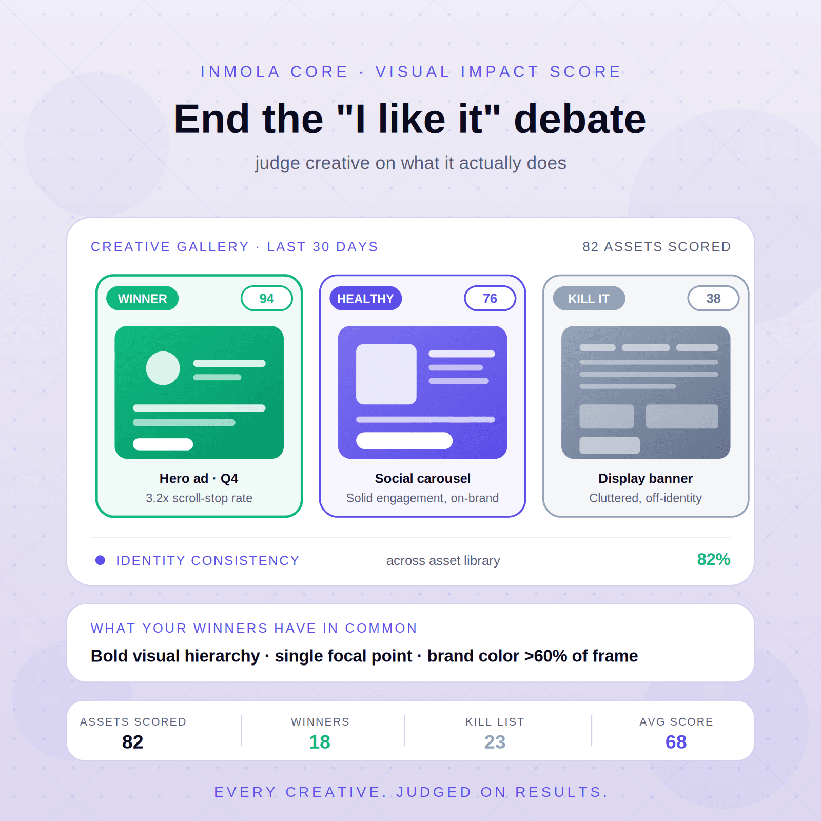
The first question is whether people can actually read your copy. The module measures the contrast of every word in the image individually and marks anything below the international accessibility threshold (WCAG) in red, directly on the visual. It also calculates what size the text will fall to in a feed: a subhead that looks flawless in a 2000-pixel design can drop to 12 pixels on a phone and become unreadable — in one retail ad we tested, 33 of 47 words were in that state. Colour-blindness checking sits alongside it: roughly eight percent of men cannot distinguish certain colours, so the module simulates your dominant colours under those forms of vision and shows the pairs that collapse into each other side by side. Green and red is the most common trap; blue and orange holds its separation. You define your brand colours once and every creative is compared against that palette — a white background or a grey shadow is not counted as off-brand, only the coloured area is assessed. The module also produces a permanent legibility profile for each of your brand colours: which can carry body text, and which only works as a background.
The second question lands on a line most brands never measure: file preparation. The module reads the weight of the file, its format and the quality setting it was saved at. One creative we tested was 2.5 MB; the same appearance was achievable at 241 KB — a tenfold difference with no visual loss. Saving a photograph in the wrong format, holding quality higher than necessary, or over-compressing until detail is lost: it reports each of the three separately. It measures how much of your image is covered by text using Meta's own method and warns you when you are above the recommended limit. Two versions of the same message can be placed side by side on the A/B screen, and there is an important principle here — if the gap between them falls below measurement precision, the module does not declare a winner, it says there is no meaningful difference. It does not manufacture decisions out of noise. The ad creative of brands you track is assessed against the same criteria: how many words they use, whether their copy is legible, how heavy their images are — shown next to your own.
For CMOs and creative leads, this ties creative quality to a measurable threshold the way every other channel already is. For agency and in-house teams, the work is judged on what it meets rather than how it was presented. For performance teams, every error caught before spend begins is an invoice that never arrives.
There is something we do not claim, and it is worth stating plainly: this module does not predict how many likes your image will get. We measured that against our own data and found no meaningful relationship between visual properties and engagement. On social platforms, engagement is driven mostly by who posted, timing, subject and copy. What we do is more modest and not in dispute: catching a weak creative before it goes live.
More in Brand & Market Overview
Related modules
PR Media Value
Stop calling PR a "soft" function — put a number on every piece of earned coverage and walk into the budget conversation with an answer, not an apology.
More detailsBrand Trends
Stop measuring brand health like a still photograph — see in real time whether your brand is gaining strength or quietly losing ground, and why.
More detailsPareto Score
Stop spreading your sales team across 800 accounts — find the 20% of companies driving 80% of revenue, and know which to chase, protect, or let go.
More details